13 Important Web Development Details
There’s a thing called the ninety-ninety rule. You’ve likely experienced its wrath professionally, personally – whatever. It goes like this:
“The first 90 percent of the code accounts for the first 90 percent of the development time. The remaining 10 percent of the code accounts for the other 90 percent of the development time.”
Yep, 90% + 90% = 180%. Not cool.
This is a simple list of things that take a site from good to great - little things that you probably already know, but maybe forgot or didn’t have time to clean up before that deadline. Let’s not forget.
1. Cursors
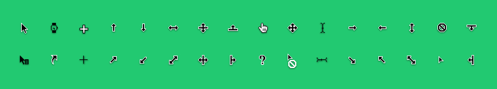
In a mobile-first world, cursors are becoming less important, but they still contribute to a great desktop browsing experience. Cursors usually take care of themselves, but sometimes the browser needs a little extra help.
When to explicitly set the cursor style:
OPTIONAL: For the entire page. This prevents the text cursor from showing when hovering over blocks of text. I find this provides a more native, polished experience. Your UI text shouldn’t prompt a visitor to highlight it.
body {
  cursor: default;
}
Any clickable elements that don’t have a pointer cursor by default. The browser will automatically use the pointer for links, but it will need to be manually assigned otherwise. For example, a <div> that triggers a JS action.
.clickable-thing {
  cursor: pointer;
}
Other unusual interactions such as dragging, rotating, cropping, resizing, inactive elements, etc.
.draggable-thing {
  cursor: move;
}
2. Transitions

CSS transitions and animations are hard to perfect. Too few and a site can feel static and lifeless. Too many and visitors won’t take the site seriously.
Transitions generally work best when:
- Tied to a specific user action. For example, hovering over a button or advancing to the next slide of a slideshow.
- Used in moderation. Not everything needs to transition.
- Executed quickly. Typically 200-300 milliseconds is plenty. No one wants to watch a button fade to a different color over the course of two minutes.
A nice, simple transition:
.btn {
  background: blue;
  transition: all 200ms;
}
.btn:hover {
  background: darkblue;
}
3. Text Selection Colors
Text selection colors are an often-overlooked detail. Make sure they look great against your site’s background and preserve legibility.
::selection {
  background: rgb(50, 50, 50);
  color: rgb(255, 255, 255);
}
::-moz-selection {
  background: rgb(50, 50, 50);
  color: rgb(255, 255, 255);
}
4. Form Focus
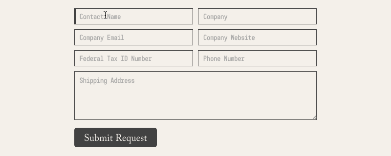
Don’t forget about the tab key!
It’s easy to get stuck thinking only in terms of clicks and taps and swipes. The tab key is an interaction that tends to fade away and go unnoticed… until it is implemented incorrectly or hijacked by some ill-advised JS.
Happy-tabbing guidelines:
- Avoid the
tabindexproperty if possible. The browser is smart and will usually figure out the correct tab order based on the DOM order. - If you do use tab index, stick to only
tabindex="-1"(removes element from tab order of page) ortabindex="0"(makes the element focusable, without setting position in page’s tab order).
Form elements need a focus and active state
In the event users are tabbing through your form (or clicking or tapping), it’s important to provide feedback and clearly indicate which field is currently selected.
// Provide feedback when form input is focused
input:focus {
  background-color: blue;
}
// Provide additional feedback when buttons are clicked / active
input[type="submit"]:active {
  background-color: darkblue;
}
5. Pixel Perfect Icons
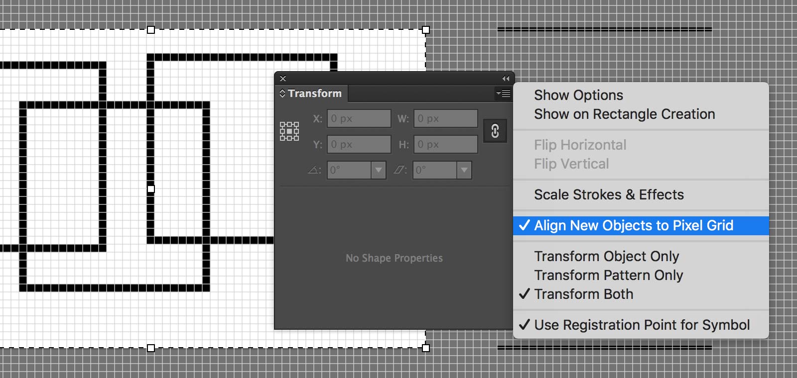
The phrase “pixel perfect” is outdated in many ways. Pixels are in direct contradiction to the web’s fluid nature. Every time you use a pixel, you are essentially rasterizing a naturally fluid medium.
That said, not everyone has a retina device. My iMac is not retina. We still need to be “pixel perfect” in the sense that icons appear crisp on any display.
“Pixel perfect” implies an attention to detail that I believe will always be relevant, even as units and best practices evolve.
In Illustrator
- Keep “Align New Objects to Pixel Grid” activated. It’s located in the transform panel options.
- Keep view > snap to grid turned on.
In Photoshop:
- Always zoom in until you can see individual pixels and make sure they’re as crisp as possible.
6. Intuitive Links
Setting links apart
If it is a link, it should look like a link and feel like a link. Every link should be clearly differentiated from its context. This is especially important when a link is buried inside a large body of text.
Best ways to style links:
- The classic text-decoration / underline
- Color
- Consistent font style for all links
- A subtle background color on the text
Be consistent! Link styles should be uniform throughout a site.
Hover + active state
Links should always have a :hover state. Although not required, an :active state can make an experience feel more native and provide the user with feedback on click.
:visited is still relevant in some cases, but its power has been limited due to security concerns.
Link targets
Links should almost never open in a new window / tab by default. Why it’s a bad idea:
- Makes assumptions about a visitor’s browsing preferences.
- Visitors can already right-click if they choose to open a new window.
- Browsers have a back button for a reason.
- It can be disorienting.
There are a few exceptions where target="_blank" makes sense:
- A site where the intention is to provide a directory of disparate content. For example, siteinspire.com opens sites from their directory in a new window.
- A web app where leaving the window would result in loss of state. For example, a Google Docs spreadsheet that contains a link.
7. Font Smoothing / Antialiasing
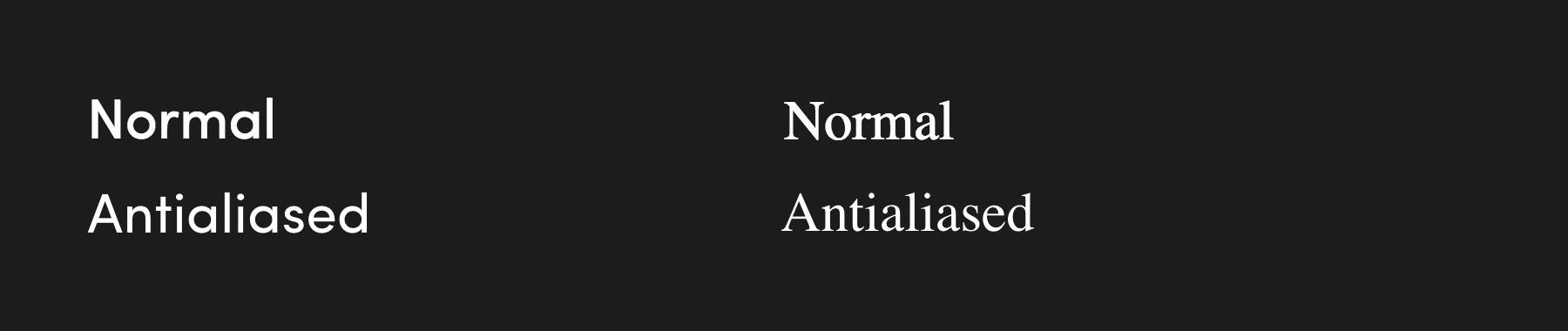
WebKit (and a few of the other leading browsers) tend to render text too heavy due to their default antialiasing settings. This can be frustrating when typography in design comps doesn’t match the web one-for-one. The font-smoothing property will make your text render just right.
body {
  -webkit-font-smoothing: antialiased;
}
If you’re on a retina device – carry on. You have too many pixels for this to be an issue. But remember that your visitors are likely browsing at a lower resolution.
8. Retina Support

You should definitely be supporting retina devices. It can be a bit of a hassle, but it’s not a lot of extra work once you have a system established.
Retina Icons
There was a time when icon fonts were the defacto way to serve retina iconography. I’ve done it. Huge companies have done it. It works. But it’s not something I do anymore. Icon fonts are a hack and there are better ways to solve the problem.
My new favorite approach is using SVG sprites. Chris Coyier wrote an awesome article explaining how this works. I use the technique he describes in conjunction with Ico Moon, an icon font generator that can also generate SVG sprite files.
Retina Images
Retina images are still tricky and browser support remains a problem. Personal preference comes into play here. I would argue that not every image needs to be perfectly crisp on every display.
Arguments for non-retina images:
- What is true retina? 1x, 2x, 3x, 4x? It’s a moving target.
- If you export most of your images at 1.5x, they’ll look significantly better on most displays. That’s still a big win.
- Just because a display is capable of displaying a 4x image, doesn’t mean a visitor wants to wait 30 seconds for it to load.
- I find exporting images somewhere between 1.5x and 2x is currently the best solution.
If you do care about perfect retina support for every image on every device, srcset is a good option. The implementation is fairly simple and the browser support is improving. The syntax is also surprisingly straightforward:
<img
  src="small.jpg"
  srcset="medium.jpg 1000w, large.jpg 2000w"
  alt="cool image"
/>
9. Error Pages
It may seem obvious, but every site needs a 404 and 500 page, at the very least. This is the perfect opportunity to turn a visitor’s frown upside down.
A good error page should:
- Be lighthearted and non-technical. Have fun with it. We get it, the “page could not be found”.
- Contain a call-to-action. In the unfortunate event that a visitor gets lost, be sure to provide useful options like “log in” or “try searching instead”. Don’t leave your visitor hanging!
10. Social Meta Tags
Social media will play a large role in getting your message out to the world. Make sure your site will look great when it shows up in a Twitter or Facebook feed.
These are the social meta tags you don’t want to miss:
- Facebook / Open Graph
Code snippets are available in the library.
11. Favicon

That tiny 16x16 pixel icon next to your browser’s address bar. Include one… or else!
Don’t forget to make sure your favicon supports retina. My favorite favicon generator is x-icon editor.
12. Alt Text
Alternative text provides a textual alternative to non-text content in web pages. Every time you include an image, it should look like this:
<img src="cool-image-of-swiss-alps" alt="Cool image of the Swiss Alps" />
I could write several posts on accessibility and why it’s important. At the very least, make sure your images have alt text.
13. Speed / Performance
Speed is the most important feature of your site. It’s more important than design and interactions and content and everything. If your site doesn’t load quickly, none of those things matter.
40% of people abandon a website that takes more than 3 seconds to load (source). Ideally, your site should load instantly.
There are tons of articles on the web talking specifically about web performance, written by experts. You should read those, but these are the general ideas:
- Use GZIP compression.
- Concatenate and minify scripts and styles.
- Compress images. “Save for web” is not enough. I recommend ImageOptim or adding image compression to your build process.
- Use appropriately sized images.
- Use caching when you can.
- Consider using a CDN.
As a starting point, I run all my sites through Google’s PageSpeed Insights Tool. It’s great at raising red flags in case I forget to optimize part of the site.